case study
case study

Brighton Science’s BConnect dashboard manages gauge repeatability and reproducibility (GR&R) data, a key process for ensuring measurement accuracy. However, inefficiencies in the dashboard have hindered usability, impacting workflow and productivity. This project aimed to streamline BConnect to simplify data management and enhance user measurement verification.

New BConnect Landing page.
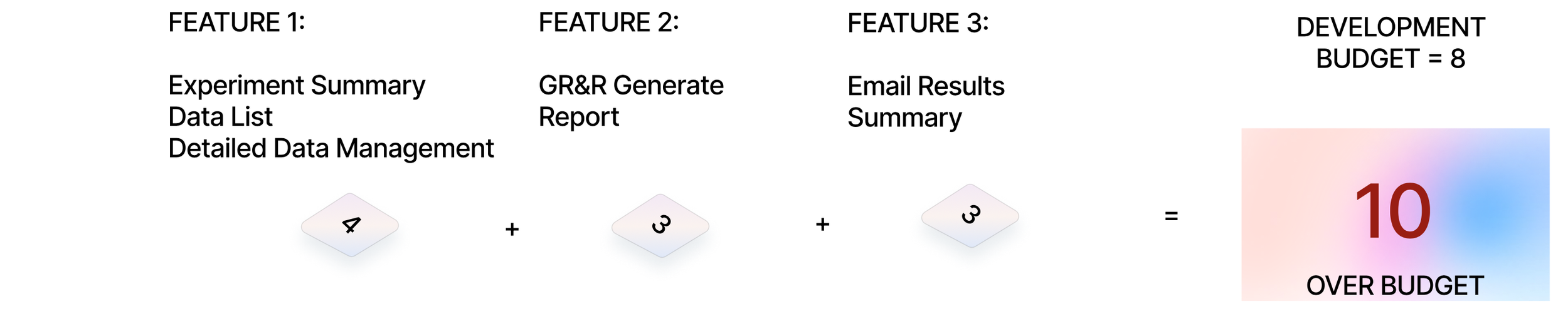
Kano Analysis
Rapid Prototyping & Researching
Competitive Audit
User Journey Mapping
Stakeholder Interview
methods
context
Brighton Science is a leader in specialized surface science measurement solutions. Brighton Science’s products and services allow companies to assess surface quality, adhesion, and contamination to optimize performance, reduce waste, and improve quality control in industrial processes, focusing on industries like automotive, electronics, medical devices, and aerospace. They sought a well-designed UX approach to extend the functionality of an existing application. The goal was to improve the application’s user experience within a limited technical framework while ensuring the design aligned with Brighton’s established guidelines. This project presented a unique challenge of working within strict boundaries while finding innovative ways to add value for Brighton’s end users.
Brighton sought to enhance their existing application used by technicians and engineers for measuring surface cleanliness and adhesion quality. The application provided essential data, but it lacked usability features that allow users to make fast and precise data collection. Users faced challenges navigating complex data sets and interpreting results in real-time, impacting productivity and, potentially, material quality outcomes.
KANO ANALYSIS


The primary issues with the BConnect dashboard were rooted in its lack of intuitive navigation. Users needed to access GR&R data quickly and easily to make timely decisions that affect product quality. Delays in accessing critical information or misinterpretations due to unclear data presentation could lead to errors in quality assessments. This could result in costly production issues or failures. A well-designed interface can significantly reduce cognitive load, enabling users to complete tasks more efficiently. To gain deeper insights into user frustrations, we conducted interviews and surveys with BConnect users. These sessions revealed that many users felt overwhelmed by the dashboard’s layout and information density. They struggled with finding key metrics and visualizations critical for their analysis.

journey map


The primary users of the BConnect dashboard are quality control engineers and manufacturing operators. These professionals rely on quick, accurate access to gauge repeatability and reproducibility (GR&R) data to make timely, informed decisions about product quality. Errors due to unclear presentation can directly impact production outcomes and lead to costly issues.
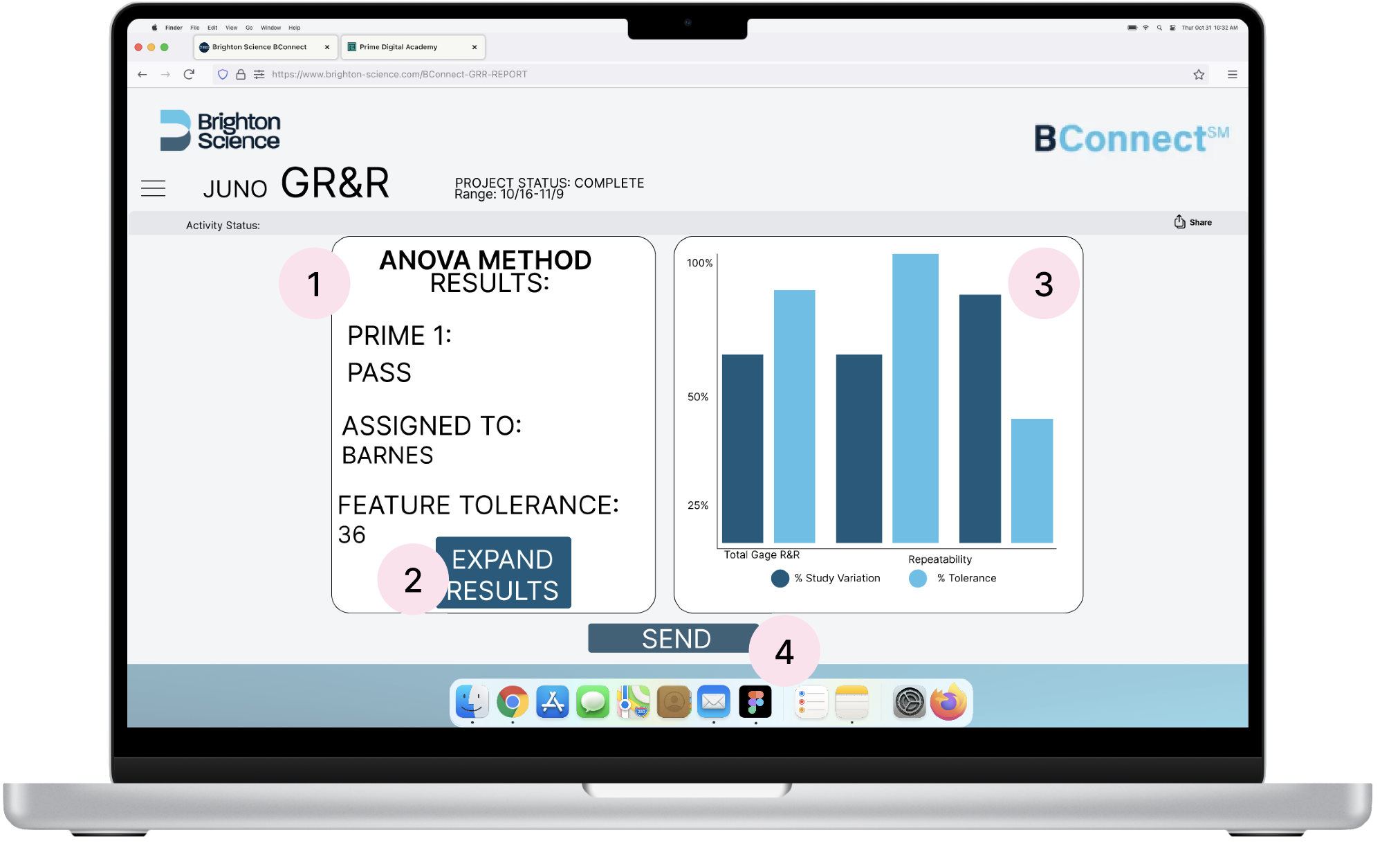
FINAL DESIGN
The final redesign of the BConnect dashboard introduced a streamlined interface centered around user needs. I prioritized simplifying the navigation structure to enable users to quickly access GR&R data. Additionally, I enhanced the visualizations for data trends, which improved clarity and decision-making. Overall, this redesign created a more cohesive data dashboard, allowing users to interpret data efficiently.