
Brighton Science

Brighton Science advances manufacturing quality through precision measurement and data analysis. Enhanced their BConnect dashboard to streamline gauge repeatability and reproducibility (GR&R) management.
Role: UX Strategist & UI Designer
Synthesized findings from stakeholder interviews with engineers and product managers.
Used Kano analysis to help prioritize features based on user value.
Mapped user journeys to highlight pain points and key decision moments.
Designed rapid prototypes in Figma and tested with over 10 users for usability insights.
Techniques
Competitive Analysis | Dot Voting | Rapid Prototyping & Research | Kano Analysis | Journey Map | Usability Testing | Stakeholder Interview ( and virtual via zoom) | Wireframing
Tools
Apple Notes Transcribe | Figma | OtterAi
challenge
Quality engineers struggled to navigate the BConnect interface, causing workflow delays and costly misinterpretations of GR&R data.

Brighton’s BConnect dock has inefficiencies in the dashboard have hinders usability, impacting workflow and productivity
key findings
Poor Usability & Navigation: Users struggled to navigate complex data, leading to inefficiencies.
Real-Time Interpretation Challenges: The dashboard didn't support fast, informed decisions in high-pressure environments.
High Cognitive Load: Dense layouts and unclear visuals made it hard to access and interpret key metrics.
Risk of Costly Errors: Misinterpreting data could result in quality issues and production delays.
Opportunity
Redesigning the interface to reduce cognitive load and improve clarity would enhance efficiency, support real-time decisions, and minimize error risks.
kano analysis
Identifying Key Features: Based on initial stakeholder interviews and user research, Brighton identified several key features to evaluate through the Kano model. These features include dashboard navigation, data visualization tools, real-time data interpretation, and performance metrics for surface cleanliness and adhesion quality.

design process
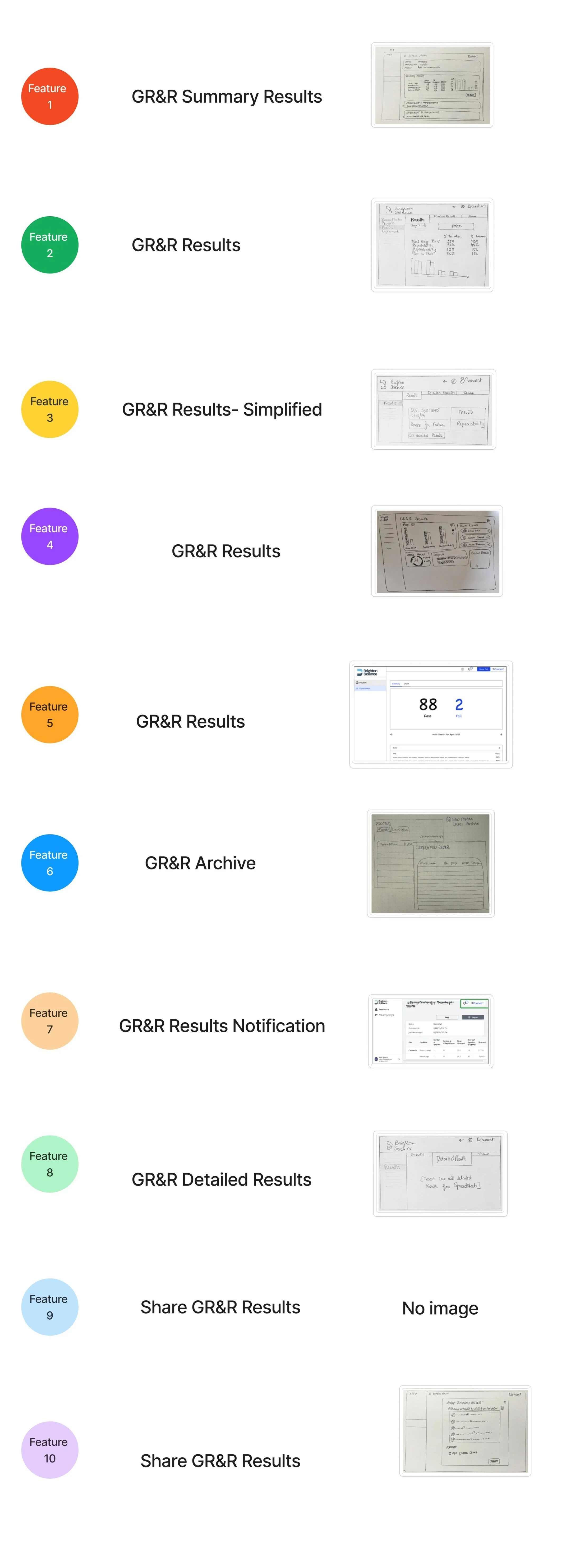

M (Must-Have): Expected and essential features.
P (Performance): Features with a linear impact on satisfaction—more is better.
Q (Excitement): Delightful, unexpected features that boost satisfaction if present.
R (Reverse): Features that detract from the experience and reduce satisfaction.
I (Indifferent): Features that don’t matter to users.
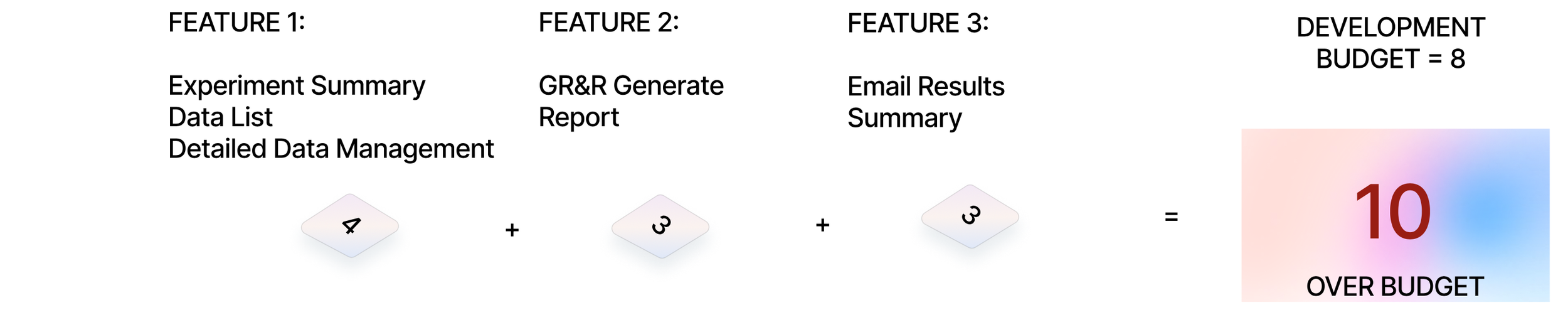
Kano Analysis was instrumental in prioritizing features and design improvements based on user preferences for this project. We clarified which functionalities were essential for user satisfaction and which could be deprioritized or developed in later iterations based on a budget scale of 1-8. This approach helped balance user needs with design constraints, focusing on improving data accessibility and visualization quality to enhance usability and reduce cognitive load.
solution highlights
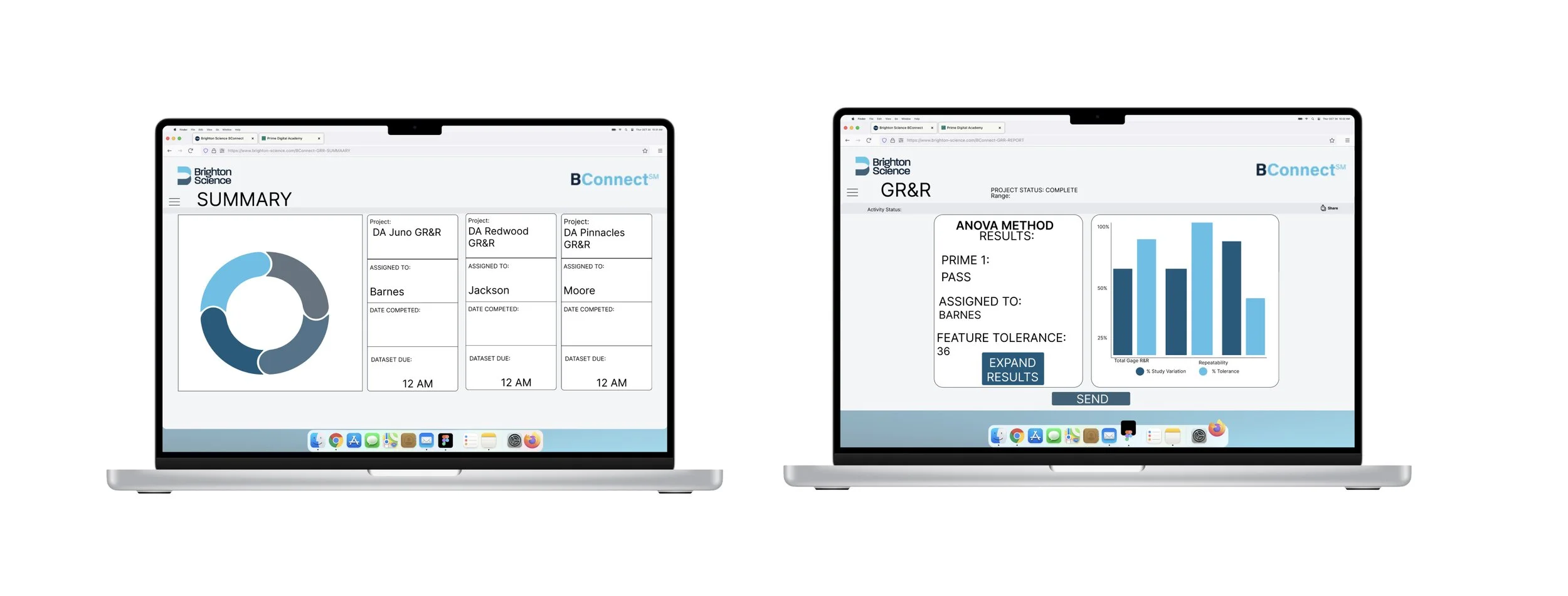
Simplified Navigation: A streamlined menu reduces click depth and improves task efficiency.
Enhanced Data Visualization: Redesigned graphs offer clearer insights, making data easier to interpret.
key takeaways
While creating the GR&R Deck, I went over budget because I prioritized the quality and depth of content, and ended up overlooking the budgeted constraints. While ensuring high-quality content is essential, balancing this with budget adherence is equally important to manage project resources effectively. This approach will help maintain focus on content quality budgeting discipline, and adherence to project goals.